Sliding box over the active item
In this article we’ll go step by step into how to create a sliding box effect over the active element in a list. Not only that, we will create a custom hook which we can then reuse and overuse as we usually do.
No time to read, just show me the code ↗
What is this effect about
This effect is often used in tabs, navigation links, table of contents etc, some of which you can already see on this blog. Why would we use this on our website/app? Well, people want to ride the trend and it just looks cool.
Once the implementation logic is in place, the rest is on our CSS imagination, for instance, we can add different styles to the active element, like border, or only border-bottom - like the main navigation in this blog , background-color - like the one in the demo, or combine all of these (and the others) - like in the table of contents in this blog.
How it works
This sliding box is just an absolute positioned pseudo-element (::before or ::after) which takes the size and position of the active element.
This implementation takes the width, height, offsetLeft and offsetRight from the active element and passes them via inline style to the list element as CSS variables --width, --height, --x, --y.
Now when changing the active element, these few lines are doing the magic:
.list::after {
  /* ... */
  width: var(--width, 0);
  height: var(--height, 0);
  transform: translate(var(--x), var(--y));
  /* ... */
}
Let’s break this in a couple of steps and see how they fit together.
Starting a new react project
This is optional, you can use any of your existing react projects or a playground like stackblitz ↗
If you do want to create a new project from scratch, you can follow the steps in this article ↗
Tailwind CSS is not required here, though we're using it for the convenience, but we will also be using react css modules for styling the list and the sliding box.
CSS module for the list and the sliding box
Let’s add all the necessary styles which will make this effect possible.
/* List.module.css */

/* Sliding box container */
.list {
  /* Recommended */
  position: relative;

  /* Optional */
  width: fit-content;
  display: flex;
  flex-flow: row;
  margin-inline: auto;
  gap: 1rem;
  flex-wrap: wrap;
  justify-content: center;
  padding: 1rem;
  max-width: 600px;
}

/* The sliding box */
.list::after {
  /* Required */
  content: '';
  position: absolute;
  transform: translate(var(--x), var(--y));
  width: var(--width);
  height: var(--height);
  z-index: -1;
  transition: all 250ms ease;
  inset: 0; /* or top-right-bottom-left of choice */

  /* Optional */
  background: rgb(102, 0, 255);
  border-radius: 6px;
}
The List component
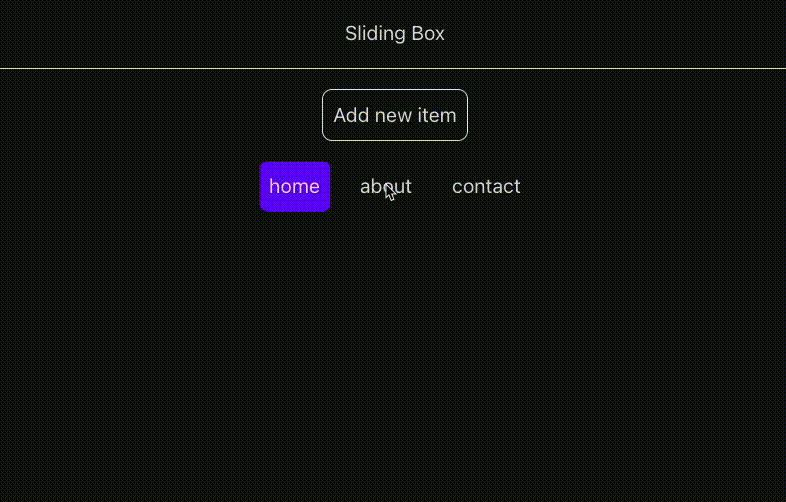
Now, we can create List component which will hold a couple of items (buttons) we’ll be using for the demo.
When clicking the item, it becomes active and the box slides over it.
Also we want this effect to work on a list with a dynamic number of items, so we’ll add another button just for that purpose.
/* List.tsx */

import { useState } from 'react';
import classes from './List.module.css';

const initialItems = ['home', 'about', 'contact'];

function List() {
  const [items, setItems] = useState(initialItems);
  const [activeItem, setActiveItem] = useState(items[0]);

  function onClick(item: string) {
    setActiveItem(item);
  }

  function onAddNewItem() {
    setItems(prev => [
      ...prev,
      `new item - ${prev.length - initialItems.length}`,
    ]);
  }

  return (
    <>
      <h2 className="text-center my-4">Sliding Box</h2>

      <hr />

      <button
        className="mt-4 mx-auto border rounded-lg block cursor-pointer p-2"
        onClick={onAddNewItem}
      >
        Add new item
      </button>

      <ul className={classes.list} style={activeBoxPosition}>
        {items.map(item => (
          <li key={item}>
            <button
              className="cursor-pointer p-2 hover:opacity-70 transition-opacity"
              onClick={() => onClick(item)}
            >
              {item}
            </button>
          </li>
        ))}
      </ul>
    </>
  );
}

export default List;
Introducing useActiveBoxPosition hook
Let’s create a small todo here:
- Create the hook
- Add a state to keep track of the sliding box size (width, height) and position (offsetLeft, offsetTop)
- Save references to all the elements we want to slide over
- Save positions of all the elements
- Add logic for making them all work together
- Lastly, plug and play
1. Create the hook
In the hooks folder we’ll create useActiveBoxPosition.ts file, which will contain the hook.
The hook will accept a configuration object with two properties:
activeItem- a value that identifies the active elementrecalculate- a list of values we will be watching. Whenever any of these values change, we will recalculate all sizes and positions of the elements in the list.
/* useActiveBoxPosition.ts */

export default function useActiveBoxPosition({
  activeItem,
  recalculate = [],
}: {
  activeItem: string;
  recalculate?: unknown[];
}) {
  // ...
}
2. activeBoxPosition state
First, let’s see what type this state is going to be. In order to pass this to the style property of our List, this state needs to take shape of a style object with CSS properties. So we’ll start from there.
interface BoxPosition extends CSSProperties {
  '--x': `${number}px`;
  '--y': `${number}px`;
  '--width': `${number}px`;
  '--height': `${number}px`;
}
As you see, we’re using template literal types to enforce the value in px.
Now we can create the initial state
const initialBoxPosition: BoxPosition = {
  '--x': '0px',
  '--y': '0px',
  '--width': '0px',
  '--height': '0px',
};
… and finally add the state to the hook
/* useActiveBoxPosition.ts */

interface BoxPosition extends CSSProperties {
  '--x': `${number}px`;
  '--y': `${number}px`;
  '--width': `${number}px`;
  '--height': `${number}px`;
}

const initialBoxPosition: BoxPosition = {
  '--x': '0px',
  '--y': '0px',
  '--width': '0px',
  '--height': '0px',
};

export default function useActiveBoxPosition({
  activeItem,
  recalculate = [],
}: {
  activeItem: string;
  recalculate?: unknown[];
}) {
  const [activeBoxPosition, setActiveBoxPosition] =
    useState(initialBoxPosition);
}
With this, our type-safe state is ready.
3. listItemsRef ref
To keep track of all the elements in the list, we’ll be using the useRef hook but not in a way that we usually do. This ref will hold an object with a unique identifier as a key and an HTML element as a value.
Let’s get the types out of the way first.
To allow for some type flexibility, the hook accepts a generic type which we will use for the elements in the list. If no type is explicitly provided to the hook, we still have a type that extends HTMLElement.
Now the hook will look something like this:
/* useActiveBoxPosition.ts */

// ...

export default function useActiveBoxPosition<ItemElement extends HTMLElement>(
  {
    // ...
  },
) {
  // ...
}
ListItems type is also going to be a generic. It will make use of the ItemElement type. Now we have it all connected.
/* useActiveBoxPosition.ts */

// ...

type ListItems<T> = { [key: PropertyKey]: T };

export default function useActiveBoxPosition<ItemElement extends HTMLElement>(
  {
    // ...
  },
) {
  // ...
  const listItemsRef: MutableRefObject<ListItems<ItemElement>> = useRef({});
}
We are using MutableRefObject because we don't want the TS to complain about the non-traditional way we're going to attach `listItemsRef` to the elements in the list.
4. Glue ‘em together
4.a Save positions of all list items
We will use listItemsPositionsRef for this.
But before we can save, we need to use listItemsRef to get all the keys and calculate positions for all the items.
// The ref to keep track of all items positions
const listItemsPositionsRef: MutableRefObject<ListItems<BoxPosition>> = useRef(
  {},
);

// ...

// Loop over all the items, calculate and save positions
Object.entries(listItemsRef.current).forEach(([key, item]) => {
  const { offsetTop, offsetLeft, offsetWidth, offsetHeight } = item;
  const itemPosition: BoxPosition = {
    '--x': `${Math.round(offsetLeft)}px`,
    '--y': `${Math.round(offsetTop)}px`,
    '--width': `${Math.round(offsetWidth)}px`,
    '--height': `${Math.round(offsetHeight)}px`,
  };

  listItemsPositionsRef.current[key] = itemPosition;
});
4.b Set active box position
As we stated above, we will use the activeItem identifier to grab the size and position of the active element.
const setPosition = useCallback(() => {
  if (!activeItem) return;

  const activeItemPosition = listItemsPositionsRef.current[activeItem];
  if (!activeItemPosition) return;

  setActiveBoxPosition(activeItemPosition);
}, [activeItem]);
Since we're dealing with expensive operations of extracting width, height, offsetLeft and offsetRight, we will use useCallback and be careful about calling the expensive recalcAndSetPosition function.
We don't necessarily want to calculate everything each time the active item changes. We just grab cached values from the itemPositions object.
4.c recalcAndSetPosition is taking care of 4.a and 4.b
const recalcAndSetPosition = useCallback(() => {
  Object.entries(listItemsRef.current).forEach(([key, item]) => {
    const { offsetTop, offsetLeft, offsetWidth, offsetHeight } = item;
    const itemPosition: BoxPosition = {
      '--x': `${Math.round(offsetLeft)}px`,
      '--y': `${Math.round(offsetTop)}px`,
      '--width': `${Math.round(offsetWidth)}px`,
      '--height': `${Math.round(offsetHeight)}px`,
    };

    listItemsPositionsRef.current[key] = itemPosition;
  });

  setPosition();
}, [setPosition, ...recalculate]);
4.d The logic to control all these pieces
Here we create the logic to only set the active box, or to calculate everything and set the active box.
Also we will add a resize event listener so that we recalculate positions when the screen size changes for any reason.
useEffect(setPosition, [activeItem]); // set the active box position
useEffect(recalcAndSetPosition, [...recalculate]); // calc and set the active box position
useEffect(() => {
  //calc and set on screen size change
  window.addEventListener('resize', recalcAndSetPosition);
  return () => window.removeEventListener('resize', recalcAndSetPosition);
}, [recalcAndSetPosition]);
4.e The hook is ready
Our hook returns an object with listItemsRef and activeBoxPosition, and now it looks like this
/* useActiveBoxPosition.ts */

import {
  useEffect,
  useRef,
  useState,
  useCallback,
  type CSSProperties,
  type MutableRefObject,
} from 'react';

type ListItems<T> = { [key: PropertyKey]: T };

interface BoxPosition extends CSSProperties {
  '--x': `${number}px`;
  '--y': `${number}px`;
  '--width': `${number}px`;
  '--height': `${number}px`;
}

const initialBoxPosition: BoxPosition = {
  '--x': '0px',
  '--y': '0px',
  '--width': '0px',
  '--height': '0px',
};

type SlidingBox<Item> = {
  /** Ref containing an array of all the elements in the list. */
  listItemsRef: MutableRefObject<ListItems<Item>>;

  /**
   * Object containing the following CSS (variables) properties of the active item:
   *
   * `--x`(offsetLeft): x-axis position in `px`
   *
   * `--y`(offsetTop):  y-axis position in `px`
   *
   * `--width`(width): width in `px`
   *
   * `--height`(height): height in `px`
   */
  activeBoxPosition: BoxPosition;
};

export default function useActiveBoxPosition<ItemElement extends HTMLElement>({
  activeItem,
  recalculate = [],
}: {
  /** A unique value representing active item in the list. */
  activeItem: string | null | undefined;

  /** Will recalculate (and map) all list elements' sizes and positions when ever any of these values change.
   *
   * Example: new item is added to the list
   */
  recalculate?: unknown[];
}): SlidingBox<ItemElement> {
  const [activeBoxPosition, setActiveBoxPosition] =
    useState(initialBoxPosition);
  const listItemsRef: MutableRefObject<ListItems<ItemElement>> = useRef({});
  const listItemsPositionsRef: MutableRefObject<ListItems<BoxPosition>> =
    useRef({});

  const setPosition = useCallback(() => {
    if (!activeItem) return;

    const activeItemPosition = listItemsPositionsRef.current[activeItem];
    if (!activeItemPosition) return;

    setActiveBoxPosition(activeItemPosition);
  }, [activeItem]);

  const recalcAndSetPosition = useCallback(() => {
    Object.entries(listItemsRef.current).forEach(([key, item]) => {
      const { offsetTop, offsetLeft, offsetWidth, offsetHeight } = item;
      const itemPosition: BoxPosition = {
        '--x': `${Math.round(offsetLeft)}px`,
        '--y': `${Math.round(offsetTop)}px`,
        '--width': `${Math.round(offsetWidth)}px`,
        '--height': `${Math.round(offsetHeight)}px`,
      };

      listItemsPositionsRef.current[key] = itemPosition;
    });

    setPosition();
  }, [setPosition, ...recalculate]);

  useEffect(setPosition, [activeItem]);
  useEffect(recalcAndSetPosition, [...recalculate]);
  useEffect(() => {
    window.addEventListener('resize', recalcAndSetPosition);
    return () => window.removeEventListener('resize', recalcAndSetPosition);
  }, [recalcAndSetPosition]);

  return { listItemsRef, activeBoxPosition };
}
Plug and play
To recap the important steps:
- Add/connect the active box styles
- Call the hook inside the
Listcomponent - Inject
activeBoxPositionstyles (css variables) into the list element - Save references to all the elements in the list
List.module.css
/* List.module.css */

/* Sliding box container */
.list {
  /* Recommended */
  position: relative;

  /* Optional */
  width: fit-content;
  display: flex;
  flex-flow: row;
  margin-inline: auto;
  gap: 1rem;
  flex-wrap: wrap;
  justify-content: center;
  padding: 1rem;
  max-width: 600px;
}

/* The sliding box */
.list::after {
  /* Required */
  content: '';
  position: absolute;
  transform: translate(var(--x), var(--y));
  width: var(--width);
  height: var(--height);
  z-index: -1;
  transition: all 250ms ease;
  inset: 0; /* or top-right-bottom-left of choice */

  /* Optional */
  background: rgb(102, 0, 255);
  border-radius: 6px;
}
List.tsx
/* List.tsx */
import { useState } from 'react';
import useActiveBoxPosition from '../hooks/useActiveBoxPosition';
import classes from './List.module.css';

const initialItems = ['home', 'about', 'contact'];

function List() {
  const [items, setItems] = useState(initialItems);
  const [activeItem, setActiveItem] = useState(items[0]);

  // Call the hook
  const { listItemsRef, activeBoxPosition } = useActiveBoxPosition({
    activeItem,
    recalculate: [items.length], // recalculate in case the list changes
  });

  function onClick(item: string) {
    setActiveItem(item);
  }

  function onAddNewItem() {
    setItems(prev => [
      ...prev,
      `new item - ${prev.length - initialItems.length}`,
    ]);
  }

  return (
    <>
      <h2 className="text-center my-4">Sliding Box</h2>

      <hr />

      <button
        className="mt-4 mx-auto border rounded-lg block cursor-pointer p-2"
        onClick={onAddNewItem}
      >
        Add new item
      </button>

      <ul
        className={classes.list} // -> apply the class from CSS module
        style={activeBoxPosition} // -> inject --width, --height, --x and --y
      >
        {items.map(item => (
          <li
            key={item}
            ref={node => {
              if (!node) return;

              listItemsRef.current[item] = node; // -> Save the reference to the list item
            }}
          >
            <button
              className="cursor-pointer p-2 hover:opacity-70 transition-opacity"
              onClick={() => onClick(item)}
            >
              {item}
            </button>
          </li>
        ))}
      </ul>
    </>
  );
}

export default List;
App.tsx
To see everything in action, we just need to add the List component to App.tsx
/* App.tsx */

import './App.css';
import List from './components/List';

function App() {
  return (
    <>
      <List />
    </>
  );
}

export default App;
We’re done!
Live demo